City of La Puente Rebranding
La Puente means “The Bridge”, ironically there are no bridges. There is however a bridge between communities and residences. With this rebrand I wanted to highlight how welcoming the homes are in La Puente. The old logo does not capture the culture and community alive in the city today.
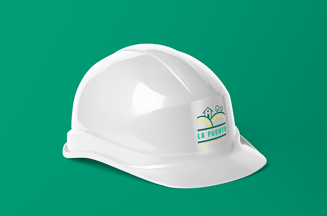
Scope : Brand Identity that can be spread across other city programs

Core Values: Welcoming to All
Progressive / Seeking to Grow
Strong Sense of Community

In the initial round of sketches I wanted to play with the idea of enclosing the city name in a container to represent the safe, welcoming homes that our community inhabits. Other forms of the container have a rounded top to give a bridge-like arch that will remind people what La Puente means. The client wanted to explore #4, 10 and 15 more.

After vectoring the top three, it was clear what the best, primary logo would be to represent an entire city's brand identity.The other two concepts did not go to waste because they represent two key parts of La Puente, the community and the city's historical legacy.